The new:
What's the past and present for this site?
What's different about the new chart?
What's the latest?
What are the data sources?
The original:
How do I install the original charting software?
How do I make a chart?
How do I get the freshest data?
What is the "24h" checkbox?
What is the "RA" checkbox?
What is all that stuff in the URL?
Why does a two-day chart has fewer points than a one-day chart.
What data is shown in the table?
How should I interpret the time axis?
When plotting wind speed, what is the secondary-y axis?
Why are there two wind options, Wind (0-36) and Wind (0-40)?
Why do some charts grow taller?
What is the delta-P charting option (Columbia Basin sites)?
How is the direction data aggregated, especially when the wind is out of the north?
What kind of software is used to make this all work?
What are the little numbers, in the upper left hand corner, to the right of the home link?
What's the past and present for this site? top
For nearly 20 years Waconia had been hosted by PNNL or Gustavus. With my retirement, came an end to this free hosting for the database and the server-sided scripting that was behind the charting page. (If you would like to host Waconia inside your local network, here is the installation guide.)
Now there's a client page built around Google Charts. It queries weather data stored in Google spreadsheets (cloud). All client sided; all without hosting costs.
The gleaner scripts continue to run, now feeding the Google spreadsheets, still hosted on a little Intel NUC existing quietly on my home network.
The scripts also feed a local database for my at-home version of the old Waconia. So the old site lives on in the comfort of my basement. The current sample charts are produced by posting to this at-home Waconia and then sending them to my free internet hosting service using FTP (yes, another Python script...).
What's different about the new chart? top
All six sensors are now in one view, ambient conditions in the top chart, wind in the bottom.
Each data point has hover tips details, time and values.
The nature of the 24hrs chart has changed. The strip-chart paint-over approach in the original chart has been replaced with a continuous display of the latest 24 hours of data. The most recent data is always on the right side of the chart. The 24hrs options is now chosen via the "number of days" select box.
There is now no hourly aggregation. Smoothing is applied to all but the wind speed and gust data. Use the checkbox to view the raw (not smoothed) data.
The delta-P, 25-day, and latest-record features are not in the new chart. Also the y dimensions of the chart area to not change with data range.
What's the latest? top
New (misc) stations: Tokyo,
Amundsen-Scott (South Pole), Saint Simons Island in Georgia, Joplin Regional Airport in Missouri.
What are the data sources? top
Data is collected from four sources:
- Waconia's first data source was the HMS web page (http://www.hanford.gov/c.cfm/hms/realtime.cfm). A gleaner script runs every 5 minutes and collects all the text from that page and then parses out wind, temperature, and pressure data. This data is written to a MS Access database. Here is a map of the 30 HMS sites.
(Perl and Python scripts: geturl.pl, pythonPostToSheet.py, pythonURLfetch.py)
- Later, NOAA data was added from Washington and Oregon pages. These NOAA sites provide data for Portland, The Dalles, and other cities in the Columbia river basin not covered by HMS. This additional gleaning is used to make the delta-P charting option available.
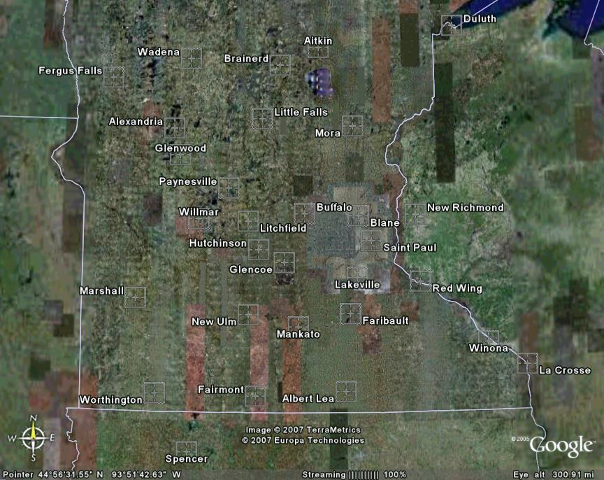
(Perl and Python scripts: getnoaa.pl, pythonPostToSheet.py)- Started data collection for Minnesota in 2006. The XML feeder is https://aviationweather.gov. Here is an example single-station call to the feeder. A Google Earth image, MN sites, shows the airports observed by this gleaner. Faribault should be handy for those that sail at Cannon Lake.
(Python script: ws_new.py)
- In 2020, added collection from the Mesonet JSON feeder. Here are links to Synoptic Data, the API and the MesoWest station viewer.
(Python script: ws_richland_json.py)
How do I install the original charting software? top
If you would like to try running the gleaners and the original Waconia web site on your local network, here is the installation guide. The guide focuses on the following:
- Configuring Microsoft IIS for classic Asp.
- Installation of the supporting charting software.
- Scheduling the gleaners.
How do I make a chart? top
First you'll need to install some stuff to support the gleaners and the rosy.asp charting page. Then come back here...
Use the five drop-down lists to control what data is presented. Click the "Update" button to refresh the plot. The drop-down lists set the following parameters (from left to right):
- Region: Pick a region. This selection affects the location options.
- Location: Select from any of the listed weather monitoring sites.
- Sensor: Select wind (default), temperature, pressure, or delta-pressure (available on for the Columbia Basin sites).
- End date: Select the last day of data to be shown in the chart (default is today).
- "Days": Select the total number of days to be presented in the chart (default is 1).
The "<" and ">" buttons (to the right of the "Days" control) step the chart backward ("<") or forward (">") in time. The size of the step is determined by the value of the "Days" control. The ">" button (to the right of the stations select list) acts to step through the stations list.
Select the "24h" checkbox to display single-day data in the 24-hour mode. When viewing today's data, this mode will present the most recent 24 hours of readings, including some of yesterday's data.
Select the "Timer" checkbox to put the chart into auto-update mode.
A brief help tip for each control can be viewed by letting the mouse cursor remain (still) on it for about one second.
How do I get the freshest data? top
You can set Waconia to auto-refresh every 5 minutes by selecting the "Timer" checkbox. This feature automatically syncs your browser to refresh 10 seconds after the 5-minute updates on the Whitebear server and insures that you have the freshest data available. Another useful indicator is the difference (in minutes) between the current time and the time stamp on the latest data record. This is shown in the last set of parentheses in the string of numbers to the right of the home link.
What is the "24h" checkbox? top
Selecting this option enables the 24-hour mode for the 1-day plot. This displays the most recent 24 hours of data including readings from yesterday. The effect of this mode is only apparent when selecting the most recent day in the day list.
There are two black vertical lines that indicate the time of the most recent reading (left line) and the current time (right line). The distance between these two lines indicates the age of the most recent data. Note that this "age" is also indicated by the minutes in parentheses () just to right of the server time. Readings from yesterday are displayed to the right of the most-recent-reading line. Yesterday's data is indicated with thinner trace lines and the direction markers are gray.
Why do this? First, it gives you a complete diurnal cycle in one consistant view. Also, it presents a contrast between today's latest reading and what was happening at that same time yesterday. The two vertical lines give a quick visual indication of the lag in the most recent reading. You can think of the left-vertical line as painting over yesterday's data as the day progresses (as it slowly moves from left to right throughout the day).
What is the "RA" checkbox? top
Selecting this option smooths the data with a 3-point running average. This feature uses a special technique to deal with near-North wind-direction data. It converts individual wind-direction observations into x and y components, averages the components, then calculates the wind direction from the component averages.
What is all that stuff in the URL (web address)? top
The URL (web page address) is now parameterized. This allows you to e-mail a link for a particular day and location, or to save a shortcut that will give you the latest data at your favorite site.
To create a URL that gives the latest data, just trim the URL back to the sensor parameter. For example, here is a URL string for the latest wind data for the Faribault, MN airport:
rosy.asp?region=MN&jS=T&hT=T&pT=F&Location=KFBL&Sensor=Wind40
Why does a two-day chart has fewer points than a one-day chart? top
Charts of two or more days of data will show hourly aggregates of the raw 15-minute data. For example, if the HMS web site presents data at 14:00, 14:15, 14:30, and 14:45, the chart will represent those four points with a single aggregate point at 2 p.m. PST (14/24 = 0.583 day fraction).
What data is shown in the table? top
The table at the top shows today's latest reading for the selected site. This is a raw fifteen minute reading and is equivalent to the current data shown at the source site. It is also equivalent to the last point on a one-day chart.
How should I interpret the time axis? top
Here are a few things to consider:
- A data point at 2:15 p.m. is an aggregate of high-frequency sampling during the 15-minutes prior to the 2:15 timestamp of the report. In other words, a point at 2:15 reflects conditions between 2:00 p.m. and 2:15 p.m.
- When charting more than one day, the axis converts to a day format and the charted points are hourly aggregates. A point at the half-day mark corresponds with an aggregate of the 12th hour (12n = 12 noon) reports (that is, conditions between noon and 1 p.m.). A point at the day mark corresponds to the 0th hour (12 midnight) reports (that is, conditions between midnight and 1 a.m.).
- In the summer, day light savings time is automatically taken into account.
- Timestamps in the table, both the server time and the "latest reading" time, indicate day light savings time with a "PDT" (Pacific Daylight Time). A "PST" indicates Pacific Standard Time.
- Whether the chart itself uses PST or PDT is determined by the end time of the chart selected. Multi-day charts that end with a date within PDT will use (for the whole chart) PDT time values.
- For the curious out there, the database is all recorded in PST. Code in the ASP page handles the conversion to PDT when needed for clarity to the user.
When plotting wind speed, what is the secondary-y axis? top
The y-axis on the right side of the plot is for wind direction. This scale is used to determine the values of the square point markers. Also see the discussion in the next FAQ.
Why are there two wind options, Wind (0-36) and Wind (0-40)? top
Both options provide wind direction and wind speed information. The direction is defined by the secondary y-axis on the right side of the chart.
The 0-40 option is the most used wind direction charting option. In this case the direction data is scaled so that the compass points correspond with the 5 mph grid lines on the chart.
The 0-36 option is a good choice for people that are comfortable thinking of direction in terms of degrees (0-360). 180 degrees on the right axis corresponds with 18 mph on the left axis; a scaling factor of 1/10. One frequent user, a sailplane pilot, prefers this wind charting option.
In either case, the secondary-y axis makes it straightforward to interpret the direction data.
For the curious, some history and development details: The chart-image module used in Waconia (ASPChart) unfortunately does not have an option for a secondary y-axis. The secondary axis that you currently see is actually a hand-built static image (a transparent gif), overlaid on the chart. Through the magic of HTML, CSS, and JavaScript, the two images are revealed simultaneously to the give the appearance of a single image. In earlier releases of Waconia, a simple compromise (using no secondary axis and no overlay image) was implemented, through which the wind-direction data was scaled by the ratio 40/360 (for the 0-40 option) or 1/10 (for the 0-36 option). Without a secondary axis, the user was left to interpret the direction points using only the speed axis and the clues in the image legend. Thanks to the image overlay in the current release, the legend has now been simplified; it's way better.
Why do some charts grow taller ? top
There is an image scaling feature for the wind, temperature and delta-p charts.
- If the wind exceeds 40 mph, the number of pixels in the chart scales (grows) with the max speed in the chart; this give an accurate visual impression of those big wind days. This feature is especially useful when you look at the wind up on Rattlesnake mountain.
- For the temperature chart, the auto scaling is based on the difference between the minimum and maximum points. If this differential exceeds 40 degrees, the number of pixels (along the temperature axis) scales with the differential. If the differential is less than 40 degrees, the data is centered within the 40 degrees of range of the temperature axis.
- For the delta-p chart, if the min to max range exceeds 0.26 (the default range on the y axis), the charts image size scales.
What is the delta-P charting option (Columbia Basin sites)? top
This option plots differential pressures between four sites: Portland, The Dalles, Roosevelt, and Richland. The differentials are defined in the chart legend. For example, the trace named "Portland - The Dalles" is calculated as the pressure difference between Portland and TheDalles (using sea-level corrected pressures).
Pressure differentials can be useful in predicting wind at Roosevelt WA. Pressure gradients often move from west to east so a good differential between Portland and The Dalles can be a good indicator of wind to come at Rosy. Differentials over about 0.05 inches Hg generally indicate sailable wind.
How is the direction data aggregated, especially when the wind is out of the north? top
For charts of two or more days, I have not implemented a method for aggregating near-North direction data (that is, directions that are bouncing back and forth between slightly greater than 0 and slightly less than 360). So I simply use the average of the 4 direction readings. This method can produce an erroneous result of approximately 180 (or 20 using Waconia direction notation) if the direction is near North (example: (3 + 359 + 2 + 358)/ 4 = 180.5).
In the one-day charts this is not an issue because there is no aggregation of the HMS 15-minute data.
Note that the RA feature properly performs a running average on direction data for one-day charts.
What kind of software is used to make this all work? top
ASP (Active Server Pages), Perl, Python, JavaScript, and VBScript are the main tools. For a little more detail, take a look at the "about the technology behind the viewer" page and the installation page.
What are the little numbers in the upper left hand corner, to the right of the home link? top
There are three categories of information in this string of numbers:
- The first set indicates the number of image requests in the last 24 hours (1d = one day) and the last 72 hours (3d = 3 days).
- And just to the right of these numbers is the time on the server when the page was generated.
- And farthest to the right, in parentheses, is the difference in minutes between the server time and the time stamp of the latest data record.
.
.
.
.
.
.
.
.
.
.
.
.
.
.
.
.
.
.
.
.
.
.
.
.
.
.
.
.
.
.
.
.
.
.
.
.
.
.
.
.
.
.
.
.
.
.
.
.
.
.
.
.
.
.
.
.
.
.
.
.